User Research · Product Advocacy
When the Feature Broke the Product
How user feedback surfaced a business-driven design decision that was quietly eroding caregiver trust, and how we made the case to change it.
Role
UX Designer · User Research & Product Advocacy
Duration
2–3 months
Team
1 designer, 1 PM
Platform
iOS & Android · Healthcare Workforce
A CEO-backed feature was quietly breaking caregiver trust. We reframed it as a business problem, and changed its direction.
Challenge
CEO-backed feature eroding caregiver trust and filter reliability
Key Decision
Separated promoted shifts into a dedicated tab
Result
Filter integrity restored. Caregivers regained trust in search results, and Hot Jobs reached a more intentional audience: caregivers actively seeking high-priority work.
At a Glance
A CEO-backed feature was pinning promoted shifts at the top of the caregiver job list regardless of any filters applied. Caregivers thought the product was broken. They scrolled past the same irrelevant shifts every time, stopped trusting their search results, and disengaged from a feature meant to drive business. User surveys and caregiver feedback confirmed it. I partnered with our PM to build the case, and we brought it directly to the CEO. The result: Hot Jobs became their own dedicated tab, giving promoted shifts real visibility for caregivers who wanted them, and giving everyone else a list they could actually trust.
Context
The platform, the people, and what they needed.
True Helix is a healthcare workforce platform connecting staffing agencies with caregivers: licensed nurses, CNAs, and other healthcare professionals looking for shifts. The caregiver mobile app was the primary surface caregivers used daily to browse open shifts, apply filters, and request the work that fit their schedule, location, and specialty.
For caregivers, finding the right shift wasn't browsing. It was work. They had specific criteria: date, location, pay rate, specialty. The filter system existed to surface what was actually relevant to them. It was one of the most important features in the app.
The Feature
A business priority pinned above everything else.
Hot Jobs was a business-driven feature, a way for staffing agencies to promote high-priority shifts that needed to be filled quickly. The concept was straightforward: surface these shifts prominently so caregivers would see and request them.
The implementation pinned Hot Jobs at the top of the Open Shifts list, above all other results, regardless of any filters the caregiver had applied. A caregiver filtering for day shifts within 10 miles would still see Hot Jobs for overnight shifts 40 miles away pinned at the top of their results. Every time. No way to dismiss them.
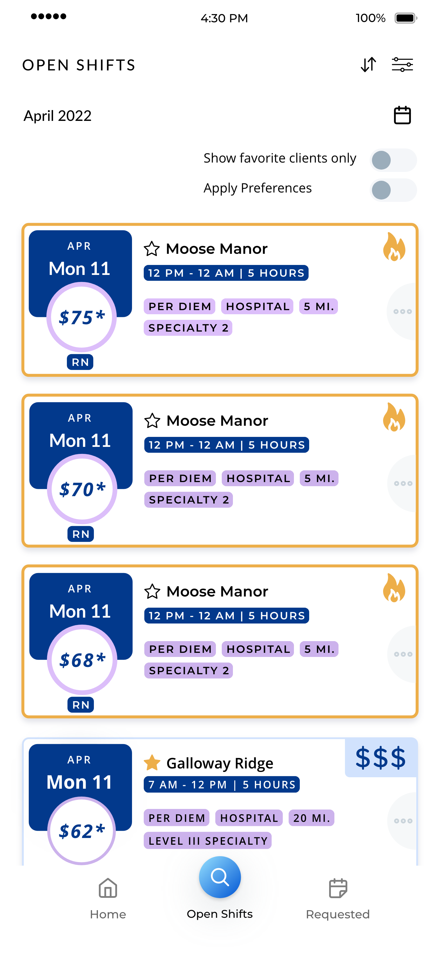
Before: promoted shifts override every filter applied. Caregivers couldn't distinguish promoted shifts from relevant ones.
What Users Were Actually Experiencing
What feedback revealed about caregiver trust.
Caregiver feedback started surfacing a pattern. Through user surveys and informal feedback that made its way back through staffing agency employees, a consistent picture emerged:
Caregivers weren't seeing Hot Jobs as promoted. They were seeing them as evidence that the app wasn't working.
They'd set their filters, scroll past the same irrelevant pinned shifts, and assume their preferences weren't being applied. Trust in the filter system eroded. Some stopped using filters altogether. Others disengaged from the app.
The feature designed to drive urgency was creating confusion. And crucially, it wasn't even achieving its business goal. Shifts that are always visible regardless of relevance aren't prominent. They're noise.
The Business Case
Why this was failing the business too, not just users.
This is where the argument became hard to dismiss. Hot Jobs weren't just bad for caregivers. They were failing as a business feature. Pinning them indiscriminately meant they blended into the background. Caregivers learned to scroll past them automatically. The feature meant to make these shifts stand out was making them invisible.
Good UX and business outcomes weren't in conflict here. They were pointing in the same direction.
A caregiver who trusts their search results is more likely to engage with genuinely relevant promoted content. A caregiver who doesn't trust their filters is more likely to disengage entirely.
User Impact
Caregivers stopped trusting filter results and disengaged from the app, the opposite of the feature's intent.
Business Impact
Promoted shifts became invisible through overexposure. Always-on visibility produced banner blindness, not engagement.
Making the Case
Weighing the options and arguing for change.
Before landing on a solution, we considered a few directions.
What we considered
Make Hot Jobs dismissible
Reduced friction but didn't fix the underlying trust problem, and put the burden on caregivers to manage something that shouldn't have existed in the first place.
Apply user preferences to Hot Jobs
Closer, but still treated promoted content as a filter override rather than a distinct product category.
Give Hot Jobs a dedicated tab
Restored filter integrity and gave promoted shifts a more intentional audience: caregivers actively looking for high-priority work.
The dedicated tab solved both problems at once: it restored filter integrity for caregivers who needed it, and it gave Hot Jobs a more intentional audience: caregivers actively seeking high-priority work, not caregivers who just wanted to find a day shift near home.
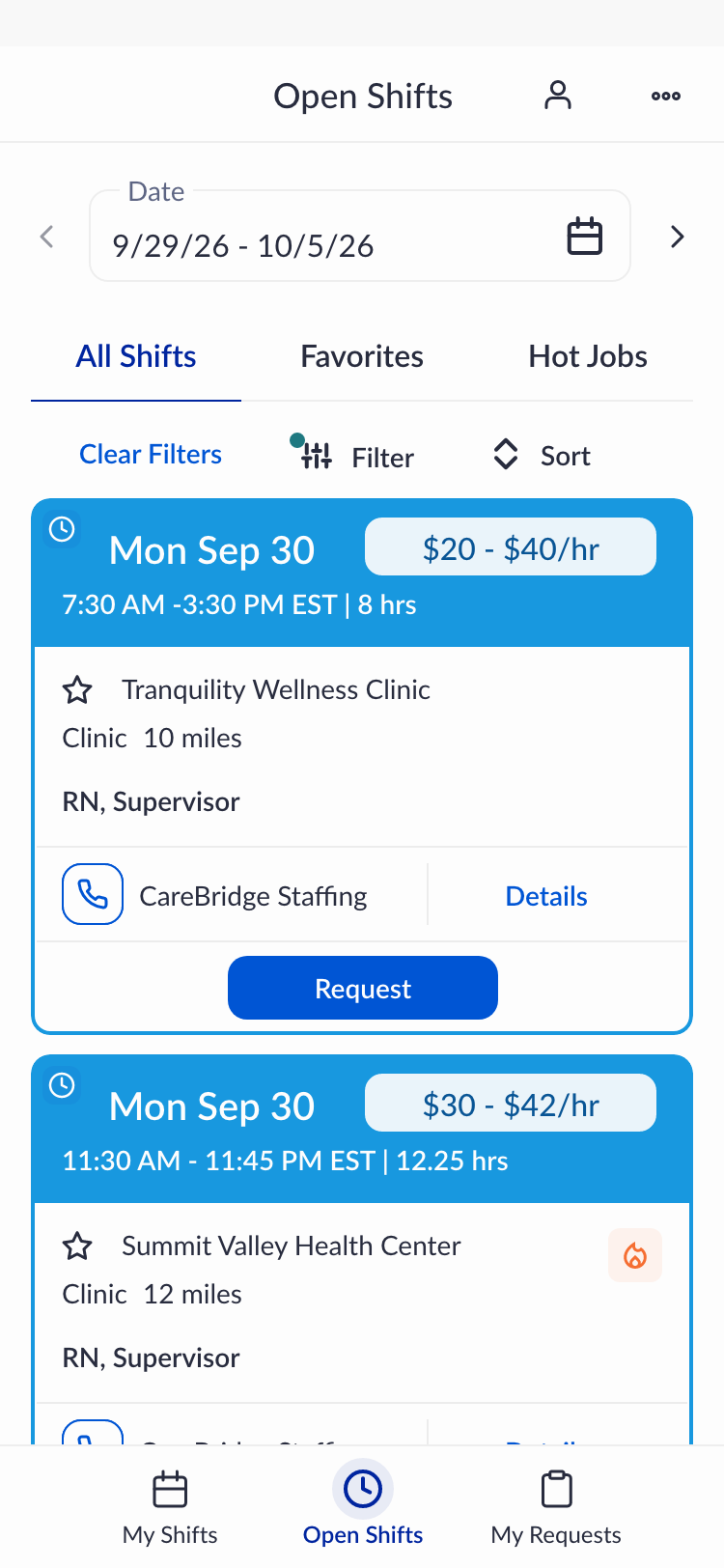
We kept Hot Jobs visible in the All Shifts list too, integrated naturally rather than pinned above everything else. That preserved discoverability without the override.
Shifts that are always visible become invisible.
The argument to the CEO wasn't “this is bad design.” It was: this feature is failing at its own goal. And caregivers who can't trust their filters disengage entirely, the opposite of what the business needed.
The Redesign
A dedicated tab, and a list caregivers could trust again.
The solution was to give Hot Jobs their own dedicated tab while keeping them visible in the All Shifts list, just no longer pinned above everything else.
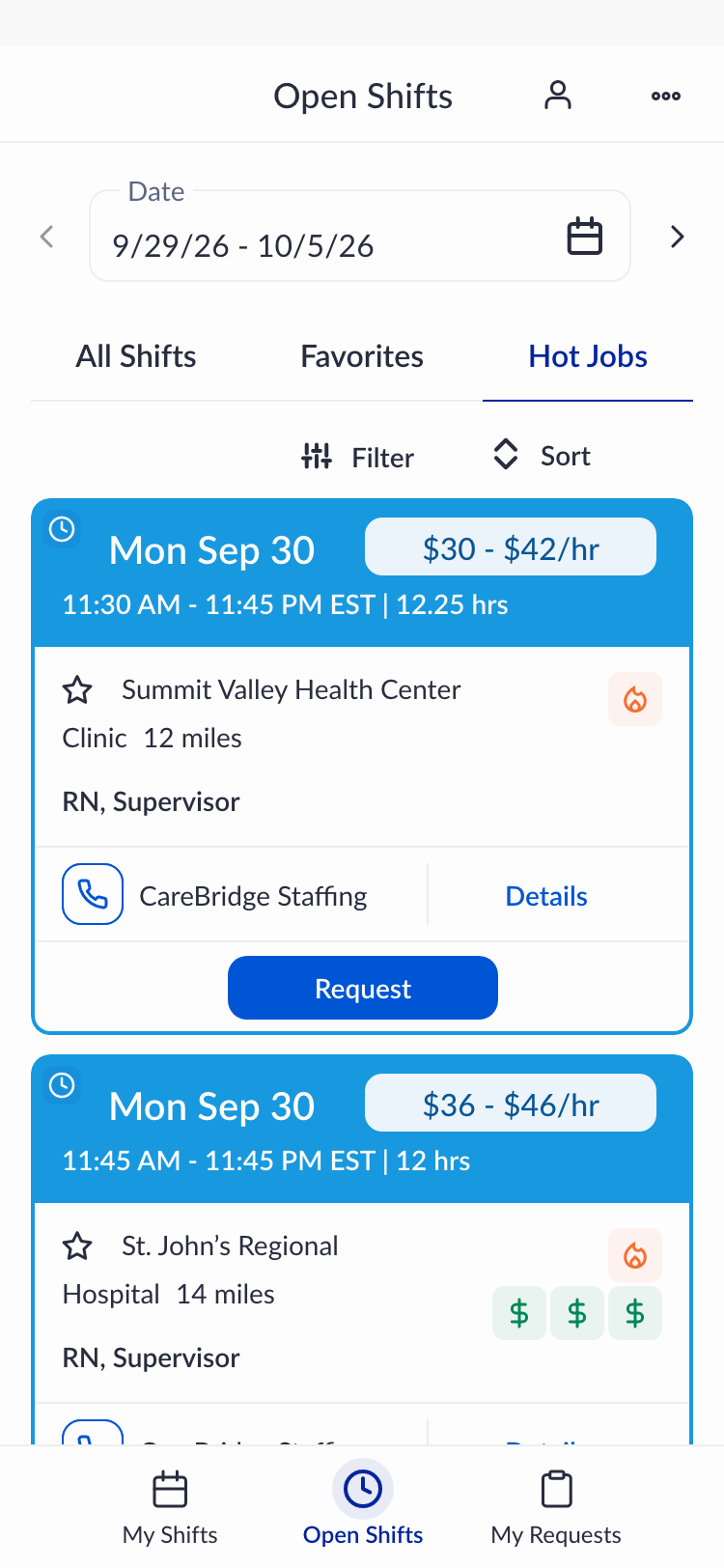
After: Hot Jobs as its own tab, filter integrity restored.
This did three things at once: it removed the filter override so caregivers could trust their search results again; it kept Hot Jobs discoverable in the main list for caregivers who encountered them naturally; and it gave promoted shifts a dedicated space for caregivers actively looking for high-priority work, a more intentional, receptive audience than caregivers who were just scrolling past pinned content they didn't ask for.
The All Shifts tab became trustworthy again. And the business feature finally worked the way it was meant to.
Handoff & Reflection
What I learned, and what I'd do differently next time.
I designed the updated experience before leaving True Helix. Implementation was completed by the team after my departure, so I wasn't able to gather post-launch data directly.
If I faced this problem again, I'd go deeper earlier on the psychology of pinned content. There's a well-documented pattern: pinned or persistent elements that users can't control tend to trigger reactance and banner blindness faster than most teams anticipate. I understood this intuitively when I saw the feedback, but I'd want to bring that framing into the initial conversation rather than after the evidence had already accumulated. Naming the mechanism earlier might have shortened the time between “we see a problem” and “we change direction.”
The broader lesson
The most effective design advocacy isn't about defending aesthetic decisions. It's about connecting user behavior to business outcomes in language that resonates with decision-makers.
The CEO didn't change course because of a design principle. They changed course because the data made the business case undeniable.
Let's Talk
This is the kind of problem I find most interesting.
When user trust and business goals look like they're in conflict, but aren't. If that sounds familiar, I'd love to talk.
Case Study · Healthcare Workforce Platform
When Building Isn't the Answer→